Showing posts with label 1930s. Show all posts

Thursday, 13 February 2014

VINTAGE: 1937 German Cookbook

Germancookbook Germancookbook Germancookbook Germancookbook

One of the perks of my job is coming across some truly delightful vintage cookbooks. Long before glossy full page photographs of baked goods became the norm - cookbooks, if they included any images often featured some wonderful illustrations for the housewife to drool over. Many of the illustrated cookbooks tend to be 1910's to 1930's in origin - their colors are rich, wonderfully detailed and honesty, I think they sell the dishes pretty well. 

I could share many, many a cookbook I come across but there's one in particular that deserves a blog post. We came across this one in particular - one published in German in 1937, at an estate sale among a collection of several early 1900's German books. It's filled with wonderful color and black and white illustrations and the most amazing and detailed font throughout. 

When you consider the year - 1937 - this cookbook must  have some stories to tell. It was the fourth year with Hitler as Chancellor and it is often considered the year his foreign policies began to radicalise. May the 6th saw the now infamous Hindenburg disaster. I get intrigued about cookbooks, especially foreign ones, how and when did it get out of Germany, who was the lady that was cooking from it in 1937? How they she and her family fare the war? Did the war push them to moving to America or did they leave decades after? It would be impressive find if the cookbook had survived the war upon a kitchen shelf in Germany when you consider just how much damage the allied forces pounded upon German cities (over 19 of Germany's major cities were destroyed 50% or more).

If only the pages could talk ... 

Wednesday, 24 July 2013

VINTAGE: Embroidered Powder Compact


Vintage compact number 62 in my collection is a sweet little compact with a flower bouquet design encased upon the top. Needlepoint decorated vintage powder compacts are few and fair between when it comes to finding them but Joe managed to sneakily buy this one for me at the weekend from an estate sales we visited. While unbranded I've managed to find some interesting information and history about this little compact all thanks to the patent number which was originally hidden under a clump of now vintage, original powder. Luckily google's patent search makes it super easily to track down and read American patents - in this case an issue date of January 29th, 1935 when a George Rosenburg of New York was issued his patent for a compact or vanity case was found. 

There's a couple of reasons why this patent and compact is a little different mostly relating to provision, adaptation and construction methods of using two different materials and so on. But what is of most interest is a little change in the mirror as described in the patent;
The ordinary vanity case is provided with a mirror on the inside of the cover facing inwardly, this being exposed when the case is opened. In accordance with a further object and feature of the invention, the bottom of the vanity includes a mirror facing outwardly which is valuable for use as a hand mirror without opening the case. This mirror makes unnecessary the extra mirror usually carried by a women in her handbag. Because the mirror is located at the bottom of the case, the cover at the top of the case may be suitable decorated or adorned to beautify the same.
George Rosenberg, 1935

That's not to say the only mirror provided in this compact is upon the bottom, inside there is a double sided mirror in the underside of the top, behind which a rogue compartment is held. Sadly over time this bottom facing mirror has faced a little extra wear but it's certainly an intriguing and practical idea. 

Wednesday, 8 May 2013

VINTAGE: By the People, For the People 1936-1943

When I came across a post on the Knitting on Trains blog showcasing some gorgeous prints uploaded by the Library of Congress, I just knew I'd be spending hours, if not days pouring over the libraries collection of vintage prints, photographs and images. It's only right to share, so over the next coming weeks and months I want to share some of them with you starting with WRP posters as they cover my favourite vintage eras - the 1930's and 1940's. I'm so excited to share these with you.

The Works Projects Administration (WPA) poster collection consists of over 900 of the original 2000 graphic, bold and diverse posters produced between 1936 to 1943 as part of President F. D Roosevelt's New Deal. With a mixture of lithograph, silkscreen and woodcut posters, they were designed to advertise cultural exhibitions, health and safety programs to travel and tourism in an America dealing with the remnants of the Great Depression. These posters were used in seventeen states including California  Illinois, Ohio, New York and Pennsylvania. While many of the WPA designs were created for the war especially aimed at women, they are worthy of a post just for those, so keep an eye out for the next set of prints.

Click through on any of the images for their source. 

Photographs, second annual exhibition, Sioux City Camera Club.
Iowa, published sometime between 1936 - 39

The Buckingham Fountain on Chicago's lake front - the "world's largest
and most beautiful illuminated fountain", published 1939
Visit the Brookfield Zoo - Illinois, published between 1936 - 38
Children's Drawings, Ohio 1939
Pennsylvania farming landscape by Robert Muchley, 1936 - 41
The United States First Foreign Trade Zone - Staten Island,
New York City, opened in 1937
These are only 6 of 900 prints they have online and I paritculary love the visit the zoo series of print they have within the WPA series. I could have shown you so many more so I encourage you to take the time to explore the prints on the Library of Congress website, there catalogue's are vast and certainly worth a visit. There's even some 1800's British cartoons uploaded too. Next up i'll show you some of the War Time WPA posters.

Wednesday, 6 March 2013

Atlas

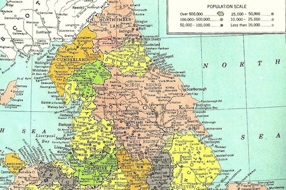
Close up of Yorkshire and the North of England - Hammond's Atlas, 1949.
Gorgeous illustration of London and the Houses of Parliament from a 1936 Atlas

Its in my nature as a former geography student to be fascinated with maps - they give such a historical and contemporary insight of geopolitics, boundary changes, wars and society. Towns can be split down a street and be in two countries, countries can fall and city names can reflect a history and or a person as in the particular instance of Russia. It was only natural that vintage atlas's would become a part of my life and it happened with a 1936 Atlas - one that depicts the Nazi flag for Germany, of a Europe on the verge of war. But many vintage atlas's go beyond showing plates of countries, they'll make delicious descriptions of countries through thoughtful narratives, illustrations and pictorial histories. 

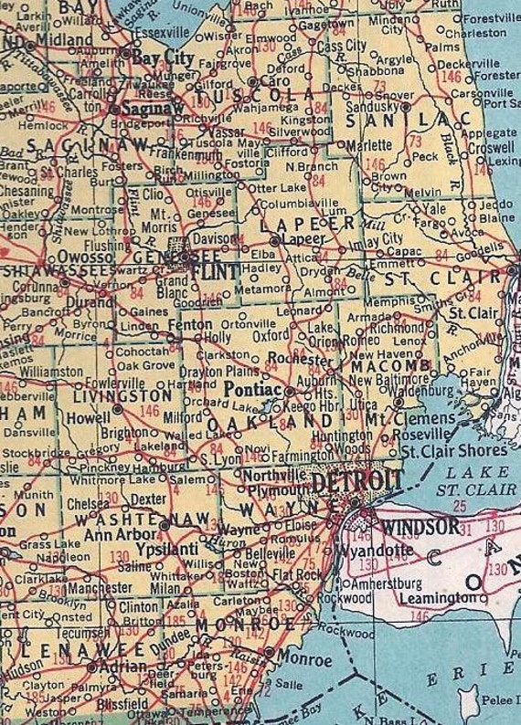
Close up of the 1949 plate of Michigan showing Detroit and it's suburbs alongside close Canadian neighbors Windsor.

The past weekend I found a Hammond's World Atlas just sat hidden on a shelf in a relatively modern home, dating to 1949 it came from a world just waking up to the aftermath of World War 2, maps show the split Germany, American had 48 states and countries still had former names - Indochina, Siam and the Soviet Union was holding strong. Each state has one full paged plate dedicated to them - as the close up of the Michigan map shows, the interlinking red lines tattooing the landscape are the long gone railroads interlinking the cities - the Interstate Freeway System seven years away (1956).

Hopefully the 1949 atlas finds a new home as it sits currently on etsy - I know if I kept it, it would be start of yet another collection, and there's only so many collections you can get away with in a one bedroom apartment while saving for a mortgage. I hope a new owner will enjoy pouring hours over the details just as much as myself. 

Sunday, 1 April 2012

A Evans meshed compact


A friend came over last night and was asking about this Evans compact which I won off ebay for just under $14 which reminded me it hadn't made an appearance on my blog. Evans became of the pronounced manufacturers of very early powder compacts. During the 1920s and 1930s they produced countless coloured advertisements of their variety of the new in thing for every lady to have when it came to powder and her beauty regime. Their 1930s range can be easy to spot by several key features. Firstly they are often very small, have a guilloche design upon the top and have a meshed bottom. This meshed bottom hangs separate to the white lining of the powder pan. This added mesh detailing adds an extra level of glamour, a shimmer and sense of moment for the 1930s lady. 

However a lot of these compacts often end up as assumed Evans products due to few of these compacts actually having any brand markings upon the actual casing. The only reference produced is the tiny circular puff, which luckily this compact still has. While there's a couple of marks around the edges both on the top and the bottom, for entering it's 8th decade it's fairing pretty well and is now one of the oldest compacts in my collection. I can only hope I can say the same about myself if I see that age.

Tuesday, 3 January 2012

VINTAGE: 1933 Century of Progress Chicago Compact


As anyone knows I have a secret love for the city of Chicago - I get the same great feeling I had about moving to and living in Newcastle [and it's the city I hint most about moving to]. Chicago was also where we had our honeymoon, so a compact that was designed to commemorate the 1933 World Fair that the city hosted was always going to be a winner.

The World Fair 1933-34

The first World Fair was held in Crystal Palace and hosted by Queen Victoria and Prince Albert. This fair, also known as the Century of Progress was held between 1933 to 1934 to celebrate Chicago's centenary with technological innovation as it's main theme, held around where the main museum campus of Chicago is today.

The compact itself is a double compact - holding what remains of the rogue in the top compartment and pressed powder in the bottom, with a double hinged mirror separating the two. It is in fact a very small compact being 2.1" x 1.7" wide - a scale representative of it's era. The famous Century of Progress logo appears upon it's blue enameled top. Overall it's in a brilliant condition for being so old - with only slight marking on the bottom - the hinges and the clasps work perfectly and comes complete with both puffs. While these commemorative compacts aren't rare [there's always a few in varying conditions on Ebay for various prices ranging from $30-100] they still command a strong selling price even though they are actually unmarked as to whom manufactured them. Nevertheless I love being able to own something from one of my favorite places especially now that the compact has entered it's 79th year.

On a related note the blog might get a bit compact heavy shortly, in addition to the two other Christmas compacts from the husband i'm currently bidding my way through Ebay. I jokingly laughed that the boy could buy the transformers lot he had his eye on if I could spend the same amount on compacts - deal done! So with $60 on my side i'm trying to get my hands on a wide range of compacts. Compacts and transformers [as in the toy not train transformers] are the only things I ever bid for on ebay - what do you lovelies end up buying there?

Tuesday, 30 March 2010

Cecil Beaton


I've always had a bit of an eye and an interest in the work of the photographer - I would say celebrity photographer but that would get mixed up in the connotations of the contemporary paparazzi media lead photographer capturing anything and everything that could never really be considered art. I have a total adoration for the work of David Bailey and while i'd heard of the name "Cecil Beaton" in passing, it hasn't been until reading the novel "Silk" by Penny Jordan in which he makes many an appearance, that I even took to sticking his name in Google. And my - I wish i'd done so before!

Capturing glamour, style and the celebrity, Cecil Beaton (1904-1980) is considered one of Britain's most influential and celebrated photographers even in turn influencing the work of artists like David Bailey. Across the five decades of his work from the 1920s onwards, he captured the faces, the fashions and the places of the then modern world - from Marilyn Monroe to the wedding photographs of Duke and Duchess of Windsor and even as an official WW2 war photographer.

And here is just such a small sample of his amazing, amazing work;

Marilyn Monroe
Capturing for Vogue the model Vionnet [1937]
Audrey
The Queen photographed in 1968 in her White Drawing Room - Buckingham Palace.
Marlene Dietrich 1935


Originalpicture lost to cyberspace


Vogue shoot for Charles James Dresses 1948
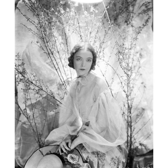
Lillian Gish 1930's


His work seems to offer something stylish yet imitate. Now I just need to hunt out books and copies of his work because they are utterly gorgeous more so the black and white ones!

Lovely!

I want to say a massive heartfelt thank you for all you that left me messages on my last post - it means a lot. I'm getting there slowly - thank you all once again!

Saturday, 13 February 2010

The Intimate Thirties

If anyone adores the 1930s like myself then this might be the book for you.

The Thirties An Intimate History has been described as one of the most insightful and colourful contributions to the research and detail of the social history of the 1930s.

Rather then focusing on the historic more professional academic mind, this insight into the flirty decade is retold through the words and the world of its citizens through their journey through life, marriage, death, birth control and social upheaval from the working class to royalty.

Uncovering the real life led by British citizens pre world war two, the hidden facts of the era are uncovered the 994 pages are just drowning in detail. I haven't had chance to buy/read it myself as of yet but every review I've stumbled across absolutely recommends it - even the Sunday Times Culture Magazine, which says something.

[The Thirties An Intimate History by Juliet Gardiner RRP £30 available from Amazon]

Tuesday, 29 December 2009

Sewing and the bachelor girl

Have you ever thought about matching your carpets, your walls or your sewing to your hair colour? Well this, according to The Big Book of Needlework was the thing for all young ladies to do so. This book has always appealed to me, it offers insightful, creative and practical designs and tips on how to get started and become a mild expert in varying household and creative needlework projects. Yet it does so in a mildly sarcastic manner and it is the embroidery chapter which offers the most charmingly imaginative guide.

“Though the modern bachelor girl of the dashing, dancing, cocktail-drinking type may abhor embroidery, purely as embroidery, when it has no definite end in view, yet there is much modern embroidery which would give character and individuality to her bachelor abode and which, done by herself would neither cost much nor take much time for its execution.

Let us first design a background for those embroideries and for a brunette. Suppose she has a large and fairy lofty room with a north light. Her main furniture consists of a good divan with plenty of cushions and a quite handsome black cocktail cabinet presented by an admiring uncle. As she is of the vivid, restless type, fond of brightness, colour and life, her walls and ceiling could be covered entirely with a good dull gilt paper, having a surface simulating a canvas weave. The woodwork to be enamelled black and a plain black carpet on the floor. If this is too expensive then the floor could be painted black and have one or two scarlet (not red) rugs. Old rugs will dye quite satisfactorily to the proper lacquer scarlet.

Now the embroideries. For boldness and speed, these must be mostly in appliqué. Place the cabinet against the wall facing the window. On the wall behind it may be hung and embroidered mural panel ...

… For the blonde girl of this same type, the walls and ceiling might be in a silvery grey with woodwork painted soft jade and a jade-green carpet. The furniture to be plain, unpainted deal to which is applied two or three coats of inexpensive silver pain. Removed handles and replace them with short jade composition bar-handles. The embroidery … divan cover and curtains to be in the same designs but in a very full soft flat yellowish pink, embroidered in jade instead of scarlet, silver instead of gold, mulberry instead of black, and soft blue instead of china blue.

… For the less sophisticated type of bachelor girl, we would suggest the pale-pink walls of the shade of those small pink anemones one buys in spring. Woodwork and carpet in a pale dove beige. The divan and two large comfy chairs with loose covers of mignonette green with uncrushable linen.

This girl loves embroidery so she has piles of cushions, pink, beige, green and natural, embroidered in rather naturalistic designs.

… Do not imagine that those schemes are extravagant and beyond the reach of the bachelor girl. That is not the case. It is simply a matter of harmonising colours. If economy is a consideration, the curtains and cushions can be all of good casement cloth embroidery cottons are very cheap nowadays and with only one room to furnish the bachelor girl can afford to devote all her money to it”. (Goldie Killin, G., 1936:197-203)

Sounds like I need to hunt out some black paint and scarlet, definitely scarlet cloth!

Quote taken from - Goldie Killin, G (1936) “Embroidery” In Paterson, A.S., Service, S. and Paton, H., (Eds) 1936, The Big Book of Needlecraft, Odhams Press Ltd: London pp 184-211

Monday, 16 November 2009

The Laurel

While having a hunt in my mam's falling to bits sewing box I stumbled across this 1930s The Laurel, Ladies Boudoir Safety Razor complete in it's original tin, razor and spare blade. I think this find was originally found while my gran worked in a charity shop purchasing anything sewing related for herself or for my mam. Perhaps, if I remember rightly, this cute little tin was hidden away in one of the boxes of vintage buttons.
Laurel Safety Razor 1930s
The presence of such Laurel safety razors are pretty much all over Ebay, thus showing they are far from rare. Yet with bids and prices ranging from 99p to £14.99 there reminds a market and an interest in such vanity and vintage finds. Measuring only 4.5" in length, it comes complete with its original instructions for use.

In comparison to contemporary packing, yet alone razors nothing compares. In its own little ways it has its own presence and beauty. Today this tin and its contents can so sweetly be presented and admired upon a vintage girls dressing table. In 70 to 80 years will our grandchildren be doing the same with products of our era?

I somehow think not.
Laurel Safety Razor 1930s

Wednesday, 28 October 2009

Postcard From the Past

[click for larger, and clearer image]
Through sorting out the half of my grans old photograph albums we stumbled across an old postcard sent to my granddad from his grandma. Capturing Hirst Wood near Skipton in West Yorkshire - where his grandma lived, we're assume from the postmark that the postcard was sent to my granddad in Hull, East Yorkshire in the September of 1930. Stamping the penny red stamp at possibly 6 or 8 [?] AM [if anyone else can read this any better - I'd be glad to hear your thoughts!].

I think the simplicity of this post should be left in stating the note between grandma and grandson ... sometimes simplicity is best ....

"Dear Arthur,
How would you life to go rambling in this wood?
That is what I've been doing,
With love,
Grandma"

Wednesday, 7 October 2009

Window Shopping

Nothing can beat a good occasion for some window shopping, when moneys tight glaring and staring into a shops window can reveal a wealth of inspiration and dreams. While more contemporary shop windows appear bland, covered in poster advertisements or the necessity to confirm their lines of plain clothing lined up on defenceless innocent mannequins.

One shop that maintains a fantasy of shopping, adding a glamour and historicity to the shopping experience is always Fenwick's - one which drew out the inspiration for this post. Fenwick's is a grand department store, while now all around the UK it originated in Newcastle - my former university city. And, every Christmas they do the most amazing Xmas displays. Although not always related to Christmas [in the past few years there has been Gulliver's Travels, Oliver Twist - I can't remember the rest]. Along the length of the shop across its windows showcase the selected story as lines of children and adults of all ages walk along in awe, taking in the story. It makes the city centre a magical place to be.

So here is a collection from Life Magazine inspired by the delights and fantasy of gazing endlessly into shop windows back in the 1930s.


Its hard to tell the blurred boundary between who or what is real, upon which side do the adults or the boy child face? While the women on the right appears "real" snuggled and wrapped tight in a fur coat, the male partner - his face appears that of a mannequin. It plays with the boundaries between reality and appearance - who is watching who?!

The appealing innocence of the child in their sturdy yet elegant pram, the fruits of the shop or stall before them their parents or guardians away from the shot. An era when eating fruit and vegetables was an everyday occurrence, away from the invention of "ready meals".

"Do you think your mother would like this? Or that?" You can somewhat image the conversation between father and daughter, yet her face remains somewhat emotionless while her father points and questions. While appearing into what looks like a wallpaper or fabric shop? Maybe they have been sent out on a mission - their bundles of shopping before them already.

Hope you enjoy the collection of photographs, from the success of the kitchen table posting (see below) I'm hoping to reinstate my posting of old photographs more regularly as long as inspiration and photograph hunting continues!

Sunday, 4 October 2009

Around the kitchen table/Within these walls #1

Often an innate object becomes a key centre point, not only for a photographer in setting their visual frame, but for us as a society, for us to conduct our daily life, our interactions and our ways of being human.

Traditionally the table, be it dinning room or kitchen became the centre-point for the day to day interactions and way of life for the family. While this still is considered to remain within the contemporary British farming kitchen, the kitchen table became the meeting point for family members, for important discussions, day to day catch ups and celebrations. Life, its up and its down, became heavily centred around the homes kitchen.

With so many meals today, or so the media depicts, and from what I know through my friends and my own student days, meals and life seems now to be developed and lived around another object - that of the TV. Rather then speaking to each other, we let the TV speak to us.

So through revisiting Life Magazine's website I stumbled across a selection entitled "Home Life 1930s" with a table being one of the key situations people are centred around. Here is just a selection allowing us into the homes, cafes and appearances of the 1930s;

A suited young gentleman, cigarette in hand is seated enjoying the company of three lovely ladies. Their hair so neatly curled, their cups and saucers in hand. Overtly feminine in her smile, the standard lamp casts a halo-like glow over her hair piece, while the empty plates and spoons lie used upon the table edging out of the visual frame.

Is the same discussion from above now being continued in another home around another delightful decorated circular table? Covered in a somewhat creased table cloth, an ornate glass vase still with blooming flowers stand proud along the cups, saucers and cakes. We can only assume the third ladies partner is taking the photograph, or does she sit along two dating couples? Or friends?

This could pass as one of the most emotive and descriptive pictures I've seen in a long while. Seated in a cafe, who are these people? Friends? Lovers secretly meeting in a cafe away from prying eyes? They are captured mid sentence, perhaps a somewhat frustrated, troubled look upon the females face as behind in the hazy distance a maid dressed in Victorian attire serves the cafe's customers.

"More sandwiches?" afternoon tea between two cheerful ladies, her hand fluttering above the tray of delights her cup resting on the table before them.

Is the young girl presenting her favourite book, her school record perhaps to the family friend, her aunt cheerily encouraged by the adult behind? The coffee table an object for drinking delights and the societal magazines underneath.

The German dramatist Gerhart Hauptmann sits along side his wife in 1931. Upon the table between their seated chairs sits the bust of a nude. While the eyes of man points in the direction of his wife, her eyes and gaze fail to catch either his or the audience, she appears glaring far into the distance, somewhat unamused.

Friday, 2 October 2009

Let Yourself Go

"If you get into your dance you'll forget your woe"

In 1936 Fred Astaire and Ginger Rogers appeared side by side in the RKO Mark Sandrich directed movie Follow the Fleet. With songs and music credited to Irvin Berlin it was sure to be a success. With many of it's songs still known and acknowledged within contemporary society - especially "Lets face the music and dance", this film is most often noted for featuring some of Astaire and Rogers most known and appreciated dancing, and in their career spanning ten films together, is the only to feature Rogers in an individual tap routine. Yet it was a troubled film with Rogers walking out midway in 1935 rehearsals claiming exhaustion and unequal treatment, with her return only coming are a resettlement of wages.

It is a plot following the separated dancing partners of "Bake" Baker (Astaire) and Sherry (Rogers) with a nautical theme throughout. It's songs, its dancing and its acting have led to to always be my favourite and most cherished Astaire and Ginger film, it's the film I probably go around singing the most because the songs are not only memorable, but funny.

And it is "Let yourself go" a song sung by Ms Rogers featuring a backing trio with a very young Betty Grable, it's big band style and power has always excited me. While I haven't sat and watched the film for months this song always appears in my head, and currently it's been stuck on replay for the past two days.


Saturday, 12 September 2009

VINTAGE: Singer Adverts

Through inheriting my Singer Sewing Machine (see previous post) I thought I'd use it as the main inspiration for searching around the internet (via the good old google search) to look for anything random to do with singer machines, then I stumbled upon the following advertisements;


1936 black and white advisement for a "modern" electric machine, one allowing the modern women the perfect way to make her own wardrobe.

1959 and the introduction of the family into the frame alongside the advertisements for portable sewing machines, especially designed to aid the function and needs of young and growing families.

Friday, 11 September 2009

VINTAGE: Singer Sewing Machine

Growing up, this old sewing machine lived in the bottom of my Gran's wardrobe. Hidden under empty bags and scarf's this Singer sewing machine rarely saw the light of day the older my gran got. When it did come out from the deepthest depths, we use to work together on her kitchen table, sewing curtains or taking up hems. With my Gran's death (I blogged about her illness the other week - saddly things took a turn for the worse) the machine has now passed into my hands, while I remember the golden drawings on the machines side the silver engraving on the face plate, I've always remembered this as a beautiful working machine.

With a few alterations from my grandad expanding the box upon which the plate box is embedded, its sunken little holder comes with two working and original bobbins and bobbin case and replacement needles, yet its case if it ever had one is long since missing. With a quick dust and a bit of oil in the right places, its near enough looking and most importantly running, like new. Once converted from its original treadle workings, its now electronically powered although the balance wheel needs a spin every now and again to get it turning.

Starting in 1851, the Singer Manufacturing Company (this name is painted in gold paint upon the top of my machine) was launched in New York following the patent of Singer's first locksmith machine. By 1890, Singer could claim to be holding an 80% share of all global sewing machine sales, employing thousands of workers. Using it's serial number embedded upon a small plate upon the box plate a good search on the Singer Company's website reveals this machine to be part of the Y-Series produced at the Kilbowie factory, Scotland in 1934.

For an old girl reaching her 75th birthday this year, she still sews like a dream, her plating still engraved and shining. While she may only have one stitch and one speed I'm proud to be her new owner. And she will be used, rather then hiding her away in the loft or sitting her aside to gather dust, she will be a working machine and an object of beauty, with a task in hand already of patchwork cushion covers.

Also as a weird coincidence one of my mams old books hidden away in the bookcase is the Big Book of Needlecraft published only a year after my Singer rolled off the production line. Now they have to be kept together, they complement each other, the book narrating the change from treadle to electric, naming the machines key parts, its oiling points and common sewing mishaps.

All ideas of anything else to sew are always welcome ...

Monday, 7 September 2009

Coloured London Blitz

Although coloured photographic film was available, the majority of visual records of wartime life, warfare and people remained captured in black and white with the rare exception coming from magazine publications, such again as Life magazine. Across TV and radio - most especially the BBC there has been a big recent screening of the outbreak of war with German 70 years ago. And I guess to some extent this has increased my interest in trying to hunt out and capture on my blog images regarding the more personal home and feminine side of the war.

Yet as most of the war time images are black and white in nature, it was a pleasant surprise to find these images taken in September 1940 of the carnage and fallout of Nazi bombs upon the streets, landmarks and homes of London by William Vandivert upon the website for Life magazine.


A small number of onlookers peer into the immense crater of the bomb causing a London double decker bus, we can only now assume, to drive into. The bus stop sign perches upright, the only normality in the sea of destruction of the shop fronts in the background.

Smoke from burning fires creates a hazy outlook towards St Paul's, a landscape of burnt out buildings, only the faded and greying cream façades maintaining their domination of the scene. the greying skies matching and the tension and atmospheric scene of wartime London.

Busy flat cap and waistcoating wearing workers try and clear up the rumble from a strike on what seems to be a private dwelling. The sturdy houses either side maintain their upright positioning, seemingly unaware of the hit next door, only the patterned and yellow wallpaper of the fallen house remains attached to the dwelling on the left, the opened doorways. The new space allowing us to look through to what appears to be, yet another bombed out residential street behind the trees. We can only question if the occupiers survived.

Sunday, 6 September 2009

The Wartime Feminine Spirit

During the same time of finding the image of the movie theatre showing Gone With the Wind (see the post below) Life magazine has a mass of images recording wartime London. Through my own visual interests and research exploring representations of femininties within contemporary images, I'm often drawn to comparisons historically and across societies. While most often subservient and passive to the control and power of the masculine body, it is often the feminine body which maintains and holds together the backbone of society, continuing norms and practices, this can most especially be seen and considered during WWII.

With many of the working aged male population fighting the terror of Hitler and Nazism, women became the working hands and labour in maintaining British ways of life, of working the fields, nursing, driving ambulances, working in the factories through to serving as Wrens.

These images captured by B. Scherman in September 1941, offer a femininity in touch with serving the nation but of maintaining both Britishness and their own pleasure and femininity of being a women even within a war.

Sat peacefully reading a magazine in a deserted space in London, this women wearing her Women's Auxiliary Air Force uniform sits alongside her gas mask marking the constant threat of possible German raids even when trying to catch a quiet five minutes.

The limited number of delivery boys is most overtly shown within this image of a young women her tricycle parked up as she delivers towels. Her femininity is redressed into an all in one playsuit, the surrounding streets edge in V for Victory signs and war time advertisements - even one for a theatre.

In Trafalgar Square, War Time love still has time to blossom with an English girl sitting and relaxing alongside her lover - a solider for the Canadian Army. For the moment the fear of the war is forgotten as they relax against the edge of the monument. Who knows the ending of their story? Did he return home safe?

In what seems a world and a situation far from the horrors of fighting or the bombed out homes which littered London probably only streets away from this Soho Restaurant. The waitress offering the male his food, another looking out onto the street.

Only the 'S' sign for an available air raid shelter demarks this street and even era as something abnormal. Figures slowly walk in an everyday manner along this what looks like a residential London street, the smartly dressed women, her coat fitted and her hand gasping her black handbag sauntering along this street. Her pale coat echoing the whiteness of the pole - marking the lost innocence of the period.